Sharper Ink
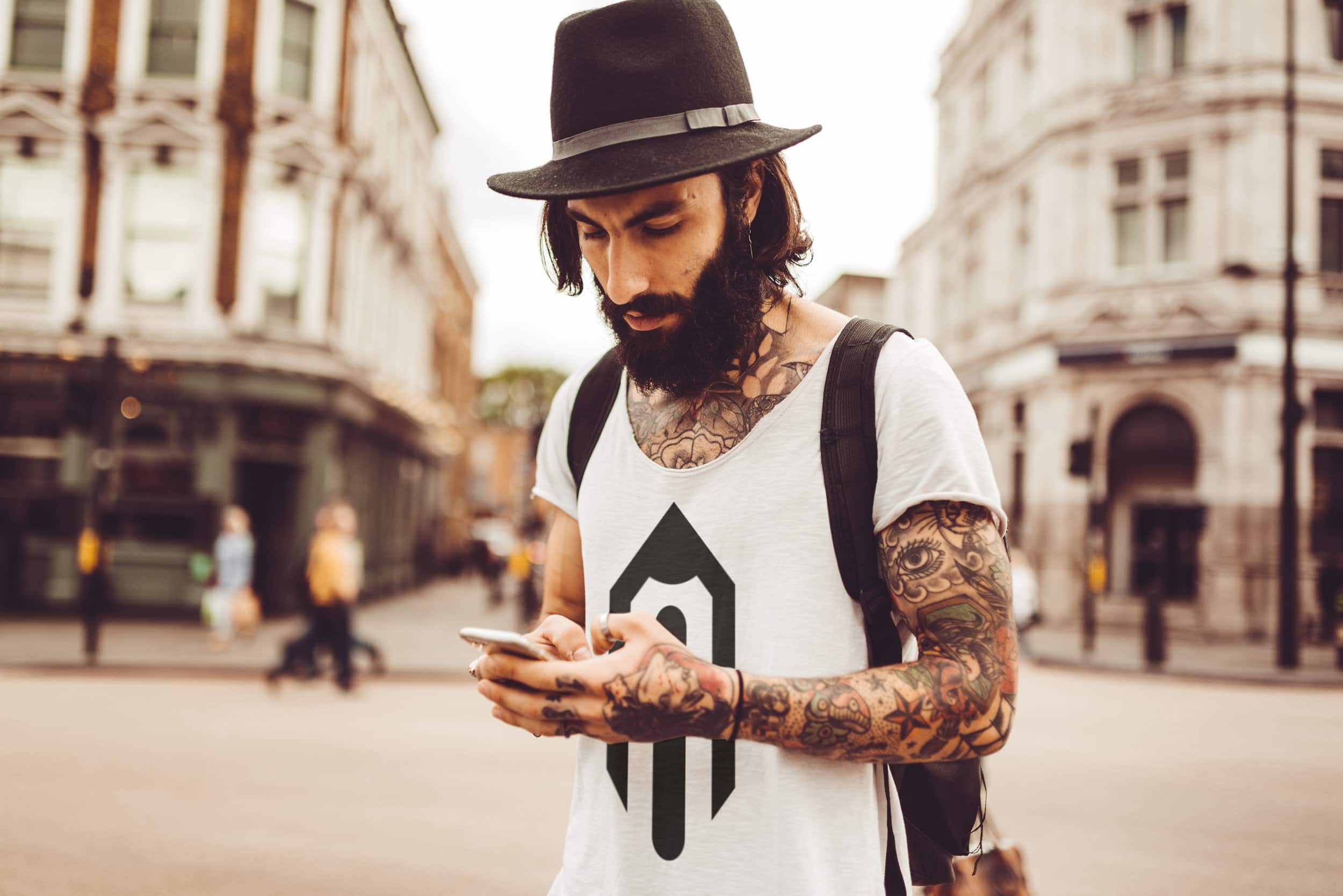
Crafting a logo for our friends in the illustration and adult coloring book realm was a true joy. Picture this: a chic, minimalist pencil – it's our little nod to the magic that happens between the lines. With a touch of trend and a dash of urban vibes, this logo is all about keeping it real and artistic. #LogoLove
-
ClientSharper Ink
-
Year2021
-
RoleArt Director
Made with