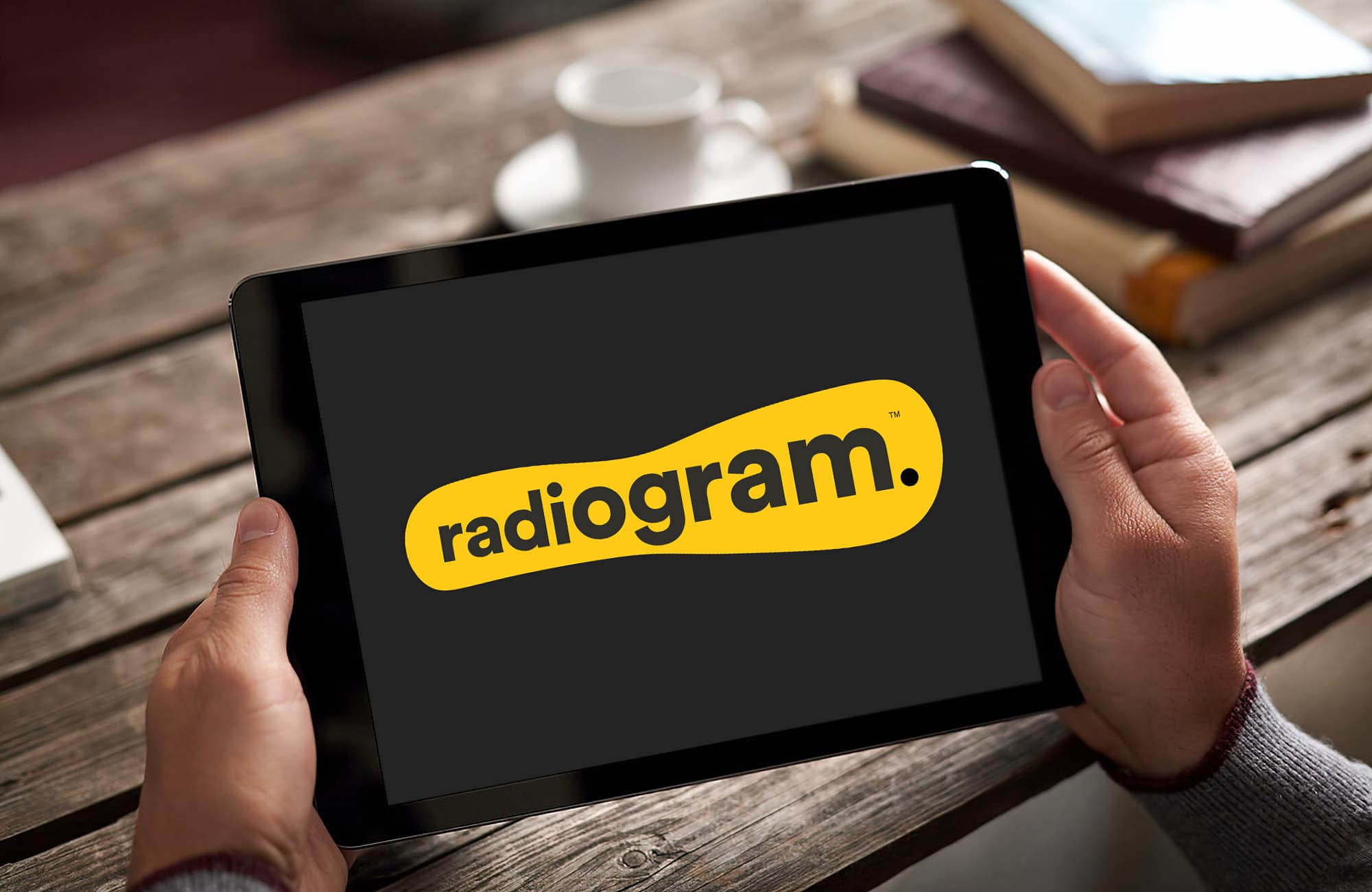
In this project, I had the opportunity to contribute to crafting the logo and website for Radiogram. The logo incorporates playful, organic shapes in a vibrant yellow hue, reflecting the brand's dynamic essence. The expanding text, resembling a sound wave, conveys a subtle sense of movement and energy.
The one-page website serves as a complement to the logo, providing a user-friendly experience that aligns with Radiogram's commitment to simplicity and accessibility. Each element, from the logo to the layout, was thoughtfully designed to engage visitors.
Feel free to explore the Radiogram case study below to see how this humble collaboration resulted in a creative and functional representation of the brand.


Leave a Comment:
Du måste vara inloggad för att publicera en kommentar.